A typeface or font gives words a tone of voice.
The font chosen for a communication plays an important, if subtle, part in our identity. Communications are most effective when the content is consistent in both meaning and appearance, and brands are most effective with a consistent tone of voice that becomes familiar across many encounters.
Readers may not immediately perceive a shift in tone if the font style changes from one encounter to the next, but when typography is consistent and seamless across print and digital media, it helps to underscore a clarity of purpose that elevates the overall impression.
Brand fonts
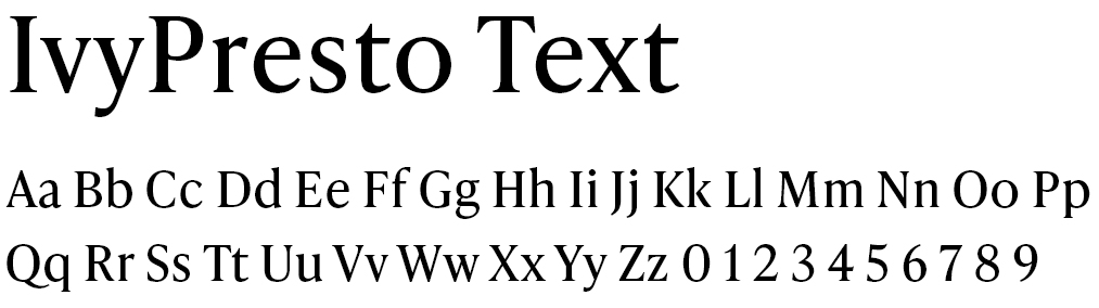
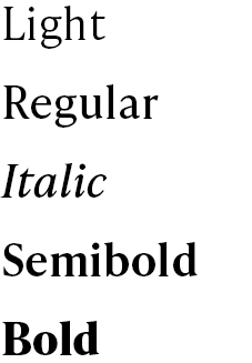
WashU brand fonts include three font families: IvyPresto Headline — a serif font to be used primarily for headlines, display text or other large text applications; and two fonts ideally suited to body copy, IvyStyle Sans and IvyPresto Text. All three fonts are available in a wide variety of weights and styles.
IvyPresto Headline
Aa Bb Cc Dd Ee Ff Gg Hh Ii Jj Kk Ll Mm Nn Oo Pp Qq Rr Ss Tt Uu Vv Ww Xx Yy Zz O 1 2 3 4 5 6 7 8 9
Light
Regular
Italic
Semibold
Bold
IvyStyle Sans
Aa Bb Cc Dd Ee Ff Gg Hh Ii Jj Kk Ll Mm Nn Oo Pp Qq Rr Ss Tt Uu Vv Ww Xx Yy Zz O 1 2 3 4 5 6 7 8 9
Light
Regular
Italic
Semibold
Bold
These are Adobe fonts and are available for free to any user of Adobe software. For non-Adobe users, the font is available for license. Or, non-Adobe users can use WashU’s alternative system fonts.
Using brand fonts to list WashU
IvyPresto Headline looks very similar to the wordmark in our logo and needs to be used with care not to confuse it as a wordmark-only variation of our logo.
- If used in a string of copy that is already using IvyPresto (in a headline, tagline, body copy), IvyPresto may be used for WashU. Do not use IvyPresto for WashU if the other copy is using IvyStyle Sans.
- IvyPresto can NOT be used for WashU if WashU is on its own or as a replacement for the university or school level logos. (This applies to merchandise as well.)
- IvyStyle Sans may always be used to list WashU in copy or when space is too small to incorporate a logo.
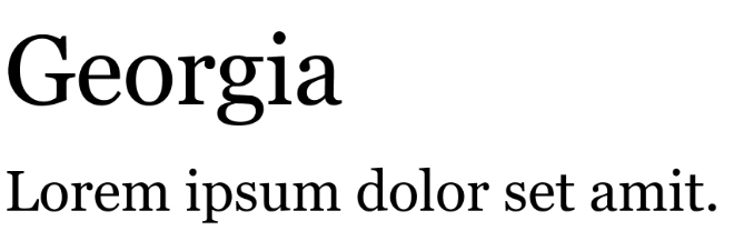
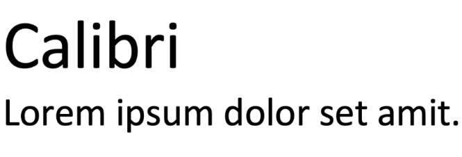
Alternative system fonts
Georgia and Calibri have been selected for use in all applications where WashU communicators do not have access to brand fonts. These fonts are nearly universal and should be available to most users both inside and outside the WashU community. Use these in ordinary office documents, PowerPoint presentations, email, etc.
Setting type for readability
Use sentence case
The ascenders and descenders of lower-case letters make it easier for they eye to understand the shape of words, increasing reading speed and comprehension. Sentence case is also best practice for accessibility in digital media where users may use screen readers. Screen readers associate strings of capital letters as acronyms. This means they read them out letter by letter instead of reading them as a word.*
CAPITAL LETTERS ARE ALL THE SAME HEIGHT, MAKING IT MORE DIFFICULT TO READ.
Use all caps with care, reserving them for special, limited cases in headlines, callouts or other display situations.
* On websites built by the MarComm team and in WashU Sites, some headings or text appears to be all uppercase, but the text is visually transformed with a style applied, so screen readers read it as normal text.
Left justified text
Columns of text should be set “left justified/ragged right” to improve readability. In this style, it is easier for the eye to find the beginning of each line, and the spaces between words are equal.