WashU’s brand is highly visual and leans into photography when presenting our key attributes to the world.
WashU photography shapes not only how others see us, but how we see ourselves. As a source of our emotional strength, we aim to be thoughtful about creative choices in subject matter and style.
assets for washu Communicators and Marketers
Pixel is MarComm’s digital asset library, which houses WashU images and brand assets. WashU staff needs a license to access them.
Subject matter
- Real people, real situations. Create and use photos that show real life, rather than staged “photo ops.” Even when assignments require staging, favor photos that show people comfortable and genuine. Actors should never pose as WashU students or faculty.
- Authentic communities. WashU is a home to individuals from different backgrounds and experiences. Strive to present accurate, truthful representations of our communities. Always consider the broadest definition of diversity.
- Location matters. The setting for the photo can be as much a subject as the people themselves. Find ways to bring a sense of place into imagery to reflect that we are grounded, diverse and globally aware.
Style
- Light and warmth. Use natural-looking lighting with a balanced background, and aim for a bright tonal range. Photos can be treated or enhanced to achieve a warm, colorful tone but should never be oversaturated. Skin tones should never be altered. Supplement with reflected or additional artificial light to avoid harsh shadows on faces.
- Active and connected. WashU images feel people-centered and action-oriented. Capture people engaged with others or with their work.
- Creative and open. We encourage photographers to think creatively and artistically, to pay attention to details, to reflect the beauty of their subject matter, and to seek opportunities to convey big ideas or emotions conceptually through wide, medium and macro views.
Examples
Portraiture conveys the personality of the person featured. Consider showcasing them in a key location, highlighting a passion or including a visual prop. While approaches can vary, use a shallow depth of field whenever possible to focus attention on the person. Use backgrounds and foregrounds that add context or symbolism but do not distract from the subject.






Mission-driven images convey the intellectual intensity and compassion in WashU’s research, teaching and patient care. Mission-driven photos show real moments of mentorship and guidance; teamwork and problem-solving; and exploration, experimentation and pushing the boundaries.





Community-focused images convey a sense of belonging, support and connectedness. They showcase WashU’s traditions and ceremonies, highlight the bonds between people and invite our audiences to feel what it’s like to be part of WashU.


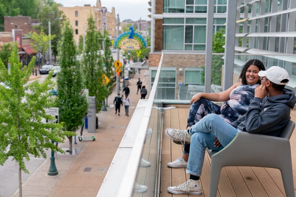

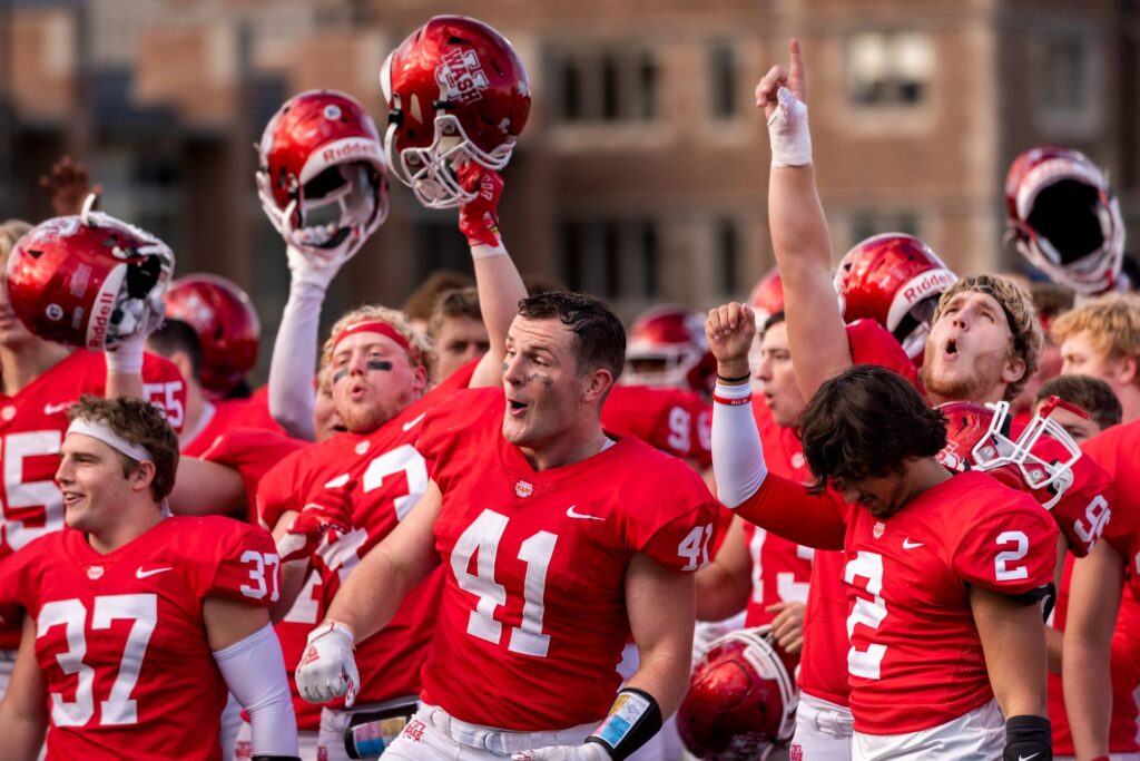
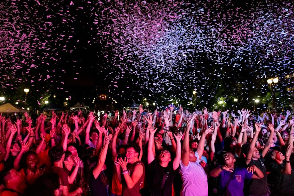
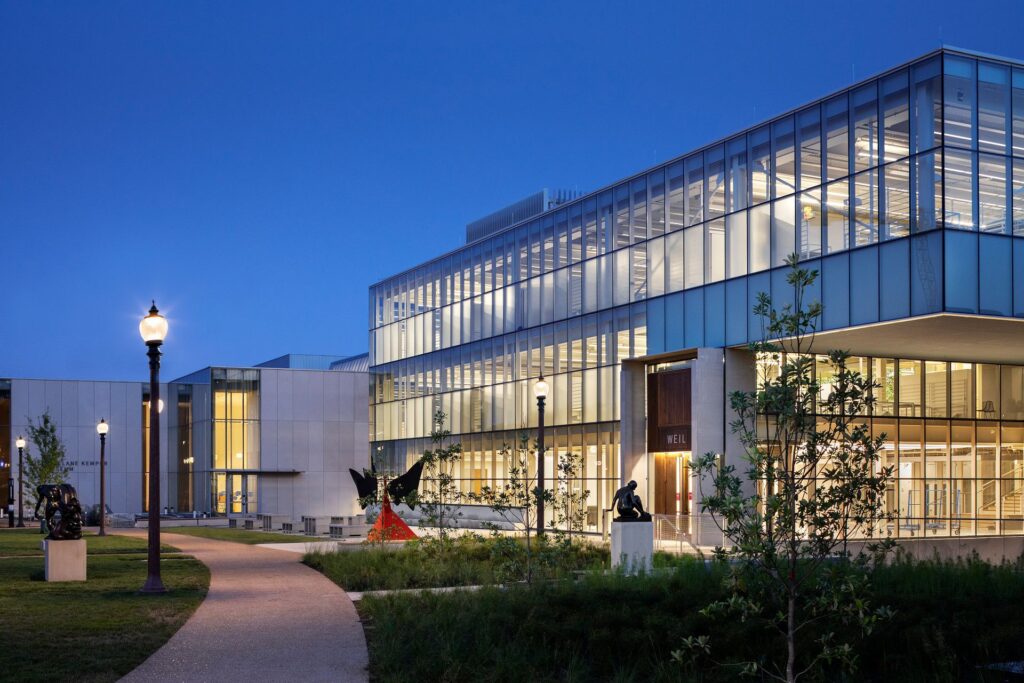
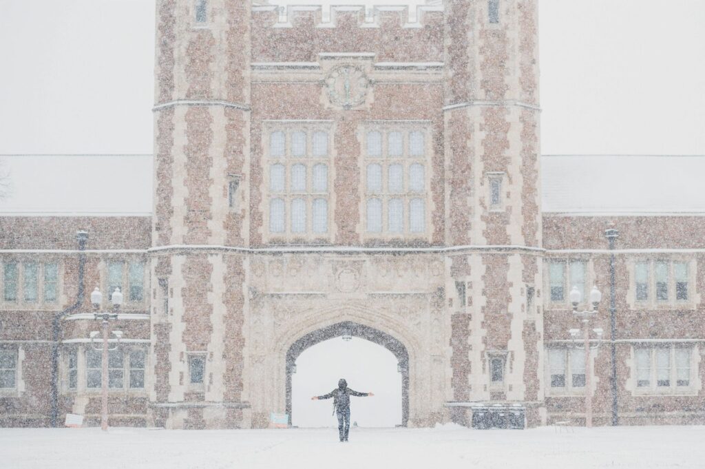
Campus imagery reflects the essence of a place. WashU’s historic architecture, the beauty of our campus’ natural surroundings and St. Louis’s four seasons can convey a distinct atmosphere. And because WashU thrives on community and vitality, show people whenever possible, but be mindful of privacy and seek consent when taking close-ups.



Best Practices
Context: When pairing WashU photography with a message, select imagery that helps illustrate the message. Consider the context of the image before sharing it with audiences.
Credits: Display credits whenever possible using the following format:
photographer’s first and last name / WashU
Exceptions: Black and white, color overlays and distinct cropping work best in the context of a campaign or storytelling series and are permitted in these special cases. Please consult University Marketing & Communications.
Layouts: Use fewer and larger images. Photos are powerful, but their power is diminished when they compete with other images in the same layout. Select a single dramatic shot as the focus whenever possible.
Stock: Stock images are permitted for abstract or location photos only when existing WashU imagery is not available.
Use With Type: Select photos that provide negative space for headlines or copy. Images that are busy or high contrast can render text unreadable or distract from the message. For web accessibility, try to apply text over photos with HTML code, rather than applying text directly to an image in a photo editor. This will ensure accessible standards to screen readers and other assistive technology. If using the WashU Web Theme, this can be accomplished without coding, using the cover image block.