Icons clearly and quickly communicate a concept to a busy audience and draw attention to important content. Icons are more memorable than text alone and help convey brand personality.
About the library
The icon library includes a variety of commonly requested icons in a simple, mono-line style that aligns with the university’s branding. The icons are consistent in style, line weight, corner radius and negative space, making them suitable to stand alone or work together in a group. They are scalable and appropriate for use in both digital and print applications across the university.
When to use
Icons bring attention to specific information and distinguish different sections or ideas in your messaging. We encourage you to use these icons intentionally to convey information rather than simply adding them as design elements to your work.
How to use
Icons are available in multiple formats for print and digital use and are organized in folders to make it easy to locate the appropriate file type for your layout. Inside the library folder, you’ll find a PDF of all the icons with names labeled, along with folders of vector SVG files and raster PNGs in red and white sized at 256px.
Maintaining clear space
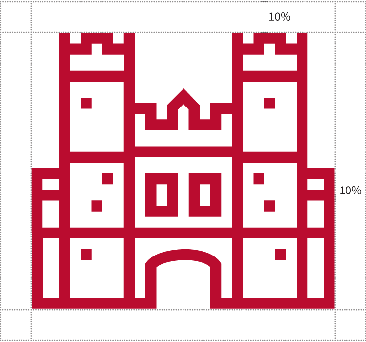
It’s important to keep the area around the icons free of type or imagery so other elements aren’t competing with your icons. To ensure this, we recommend that each icon never appear closer than 10% of the icon’s total height or width to any other typography or artwork (see example at right). This clear space may be adjusted in certain circumstances, but you should still take care to separate the icon from other page elements.
Altering icon color
All icons in the library are provided in red, but you may alter the icon to any other color within the WashU color palette to fit within your layout. The SVG filetype is easily editable in Adobe Illustrator and other design software. If you’re using an icon for a printed piece, please make sure you’re using CMYK colors; for websites, please use RGB or Hex values.

Color contrast
Generally, we recommend using a white icon when placed against a color background. Color contrast ratio is an important accessibility consideration, especially for websites, so make sure the icon color meets a minimum contrast ratio of 4.5:1 against the chosen background color. Color combinations can be checked through the WebAim.org – Contrast Checker website.

Creating new icons
Icon template
New WashU line icons should adhere to the following web-optimized standards. Icons used for print may require further size adjustments, but starting with these standards ensures consistent proportions and spacing.
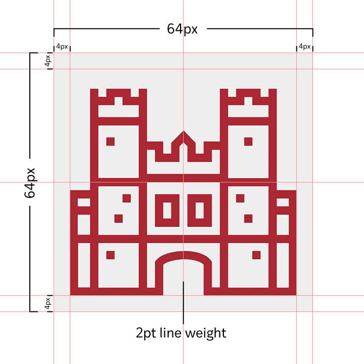
- 64px x 64px canvas size
- 4px margin on all sides
- 2pt line weight
- Red (#BA0C2F) or White (#ffffff)
- Transparent background
Design guidelines for new icons
Corners may be round or sharp depending on the object.


For consistency and to mimic architectural lines, buildings should have sharp corners.


Open lines and ended lines terminate with a round cap.

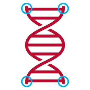
Single objects should have a continuous outline and/or an unbroken line.


Multiple and/or overlapping objects may be defined by line breaks.


Repeated line patterns should be spaced 5.5 pixels apart center to center.


The heads and faces of people should be oval-shaped and may also taper at the chin.


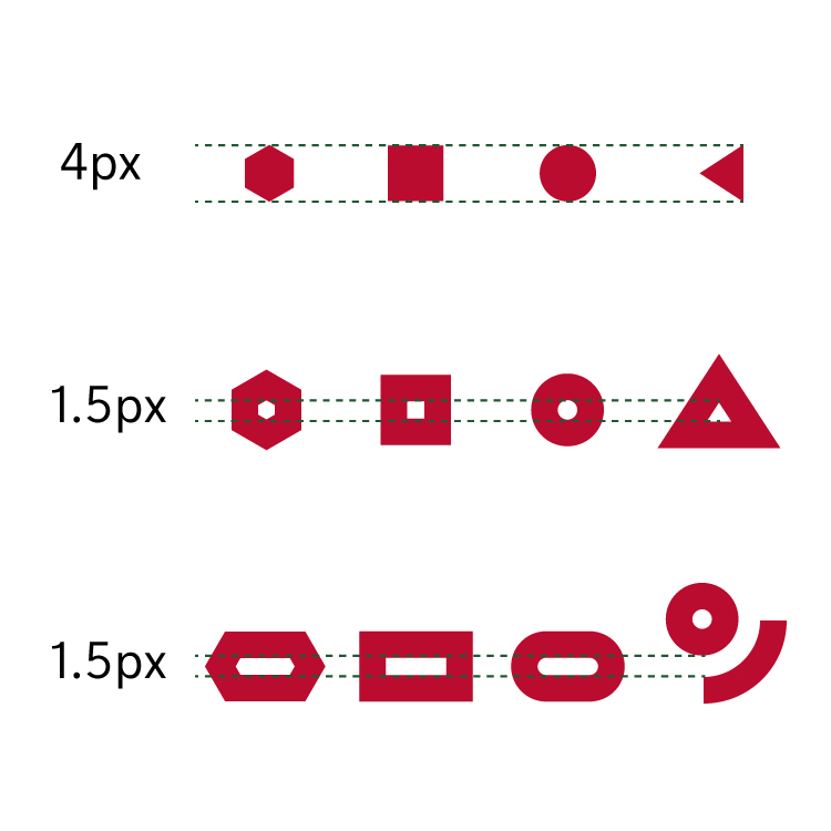
- Solid polygons should have a maximum width or height of 4px
- Outlined polygons should have a minimum of 1.5px of the narrowest interior side
- Minimum space between lines should be 1.5px
Submitting icons
We know that many talented designers in our community regularly use and create icons for WashU. If you create an icon that may benefit others at the university, and it adheres to the design guidelines listed above, we would love to consider it for possible future inclusion in the icon library.
Please contact Kristen Gau if you have an icon to submit.