General guidelines
The guidance on this page refers to the official WashU logo.
assets for washu Communicators and Marketers
Pixel is MarComm’s digital asset library, which houses WashU images and brand assets. WashU staff needs a license to access them.
Logo use on backgrounds
The full-color logo should be used on light backgrounds. The reverse logo should be used on dark backgrounds. Note that the reverse logo includes a reverse shield. The full-color shield should not be used with the reverse word mark.


Minimum size
The logo should not be used at a size smaller than the recommendations.

For print applications, the minimum size of the logo is 1.5 inches wide.
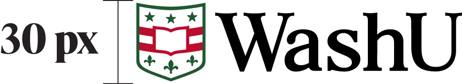
Digital
For digital applications, the minimum size of the logo is 30 pixels high.
Clear space
When using the logo in your application, it is important that the area surrounding the logo remain free of any text or imagery so that nothing competes with the logo for the viewer’s attention. To ensure this, the minimum clear space around the logo is defined as the height of the shield on all sides. This clear space may need to be reduced when placing the logo in a website, but designers should still take care to separate the logo from other page contents, such as in a header bar.

Logos within a layout
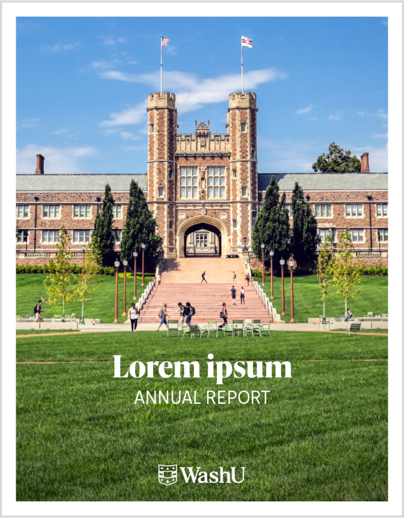
The logo should appear on either the front or back of any printed communication and on every web page or electronic communication.
Sizing and placement
Use discretion when placing and sizing the logo. In most cases, it does not need to be prominently displayed. It should occupy a position in the layout hierarchy that serves as a signature. It should not be the main focus. It should be large enough to be legible and proportionate to the design, but no larger.
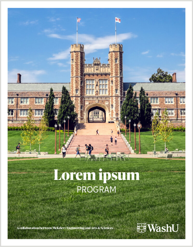
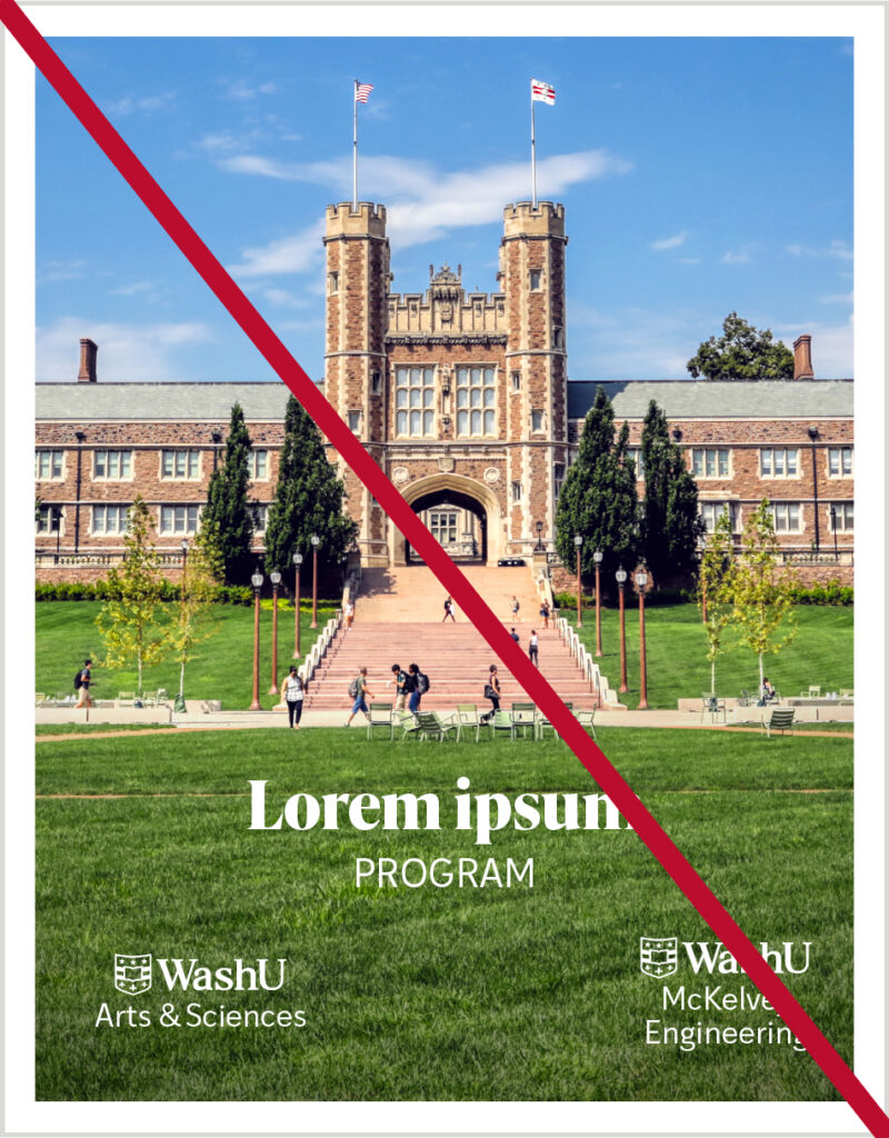
One logo
No more than one university logo should appear within the layout of the same page. For example, if a page includes the WashU logo, it should not also include a school or other unit logo.
For situations that require co-branding or partnering of two or more university units, the “one logo” rule still applies. Use the WashU logo and list the sponsoring schools or units in ordinary type instead.
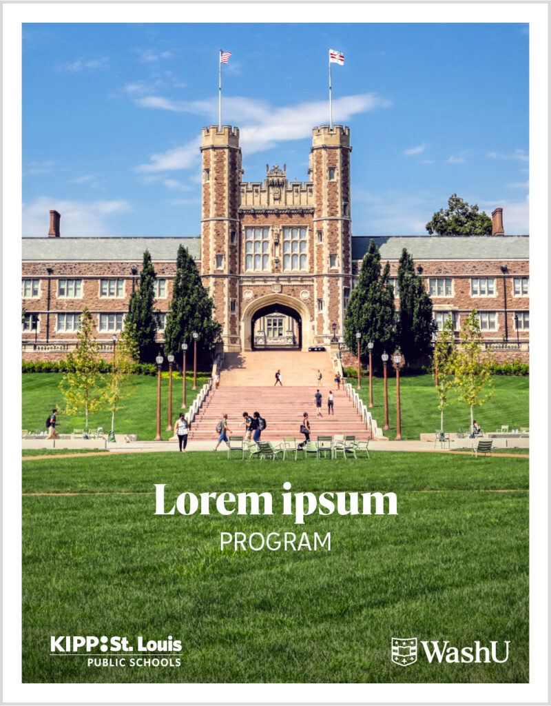
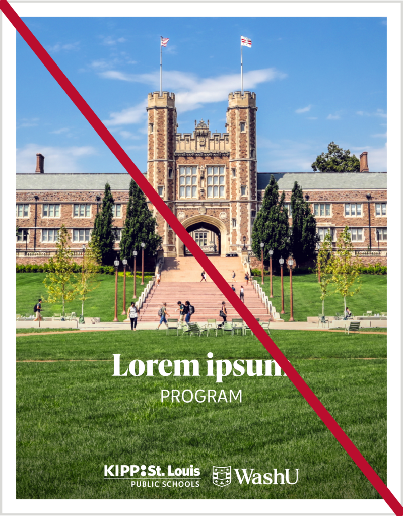
Partnerships
When the WashU logo is used alongside the logos of other institutions (such as a sponsorship, partnership or other affiliation) separate the logos by at least the minimum clear space — the height of the shield.
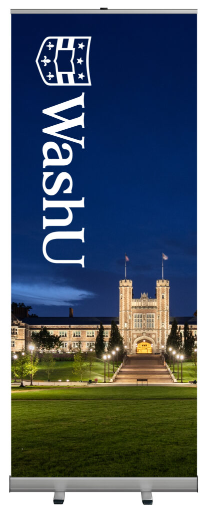
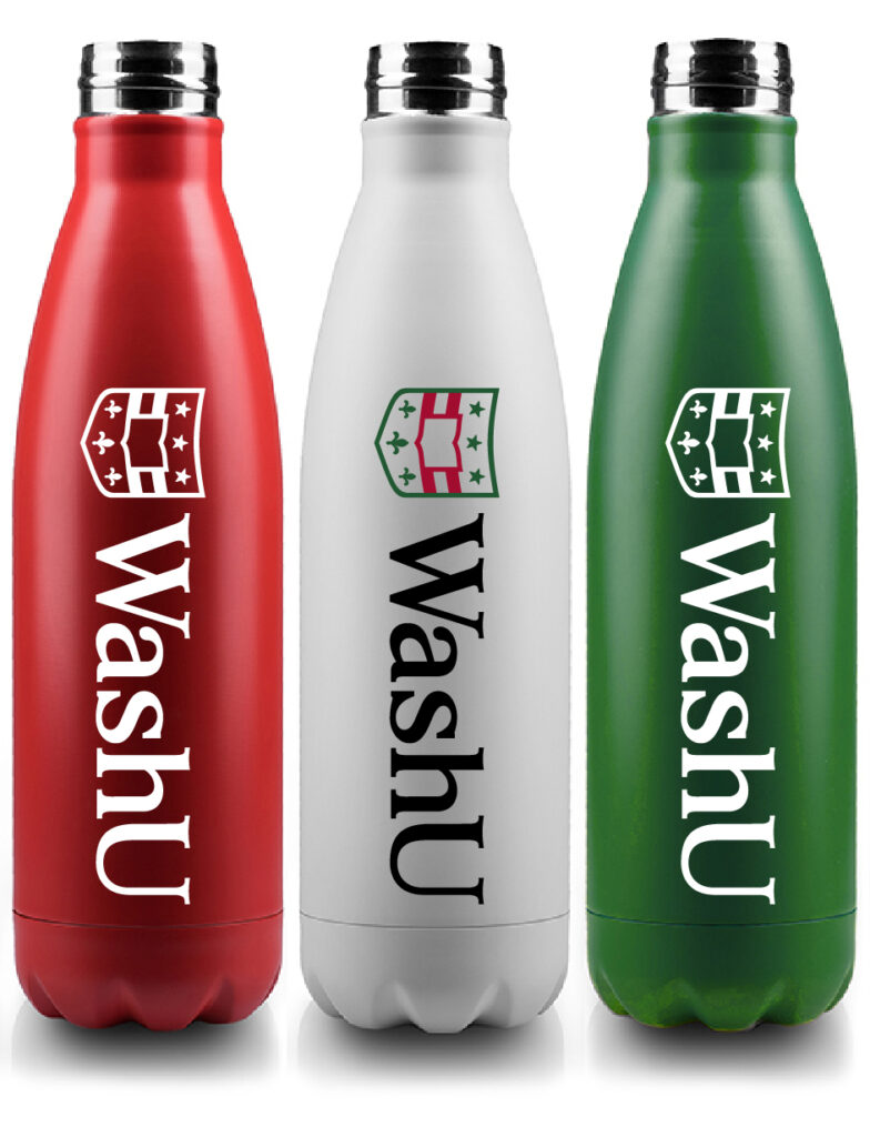
Rotation
In certain cases, it may be permissible to rotate the entire WashU logo 90 degrees so that it better fits in a tall vertical space — a banner, shirt sleeve, water bottle, etc. When rotating the logo, the shield should be at the top.

Within text
Do not repeat the logo in the tagline or body copy of messaging or marketing materials. On websites, keep the text as live type for accessibility and screen readers. The logo is already in the sticky header of our sites, so an additional one is not needed.
Exceptions include pieces in which there is limited time or space to include the logo elsewhere: End frame of a video, small digital ads, etc. This should be used only with approval from University MarComm and if the logo cannot live on its own.

Unapproved uses
The WashU logo must always be reproduced from approved artwork and can never be altered or amended. Any alteration to any WashU logo is strictly forbidden. Here are examples of unauthorized alterations that are not allowed.

Do not use the WashU word mark without the shield.

Do not stack the shield and the word mark.

Do not resize either the shield or word mark.

Do not substitute a different font for the word mark.

Do not use any part of the logo in unapproved colors.

Do not add new elements to create a new logo.

Do not add any new words to attempt to create a new logo.

Do not fill the shield with white. It should always be transparent.

Do not use the full-color shield with the word mark in white, only black.