Color is an important part of visual branding. With consistent use, a particular color or color combination can be closely associated with a brand. Color is a way for the wide variety of WashU communications across many media types to present a cohesive visual expression.
Primary color
Lead with red
WashU’s primary brand color is red. When choosing colors for your communications, WashU red should have visual prominence. WashU red has become (with consistent use) closely associated with our visual brand, and we want to build upon that strong association. Layouts should lead with red.
WashU Red
Print:
Pantone 200
CMYK 0, 100, 59, 24
Web:
#BA0C2F
RGB 186, 12, 47
Secondary color
WashU’s secondary color is green, which is a complement to the primary red. Use care in combining red and green as they can have significant visual tension and can also be indistinguishable for people with certain color blindness. Red and green are used strategically together, as in the full-color WashU shield and in our athletics logos.
WashU Green
Print:
Pantone 350
CMYK 80, 43, 83, 42
Web:
#215732
RGB 33, 87, 50
Accent colors
The accent color palette is a carefully selected collection of hues that are intended to work well with WashU red and WashU green, as both complements and contrasts, as well as neutral shades. These colors are designed to support the main brand colors. Don’t use the accent colors as the main focus of layouts.
Dark Red
Print:
Pantone 7427
CMYK 25, 100, 82, 22
Web:
#971B2F
RGB 151, 27, 47
Dark Green
Print:
Pantone 627
CMYK 84, 55, 70, 64
Web:
#13322B
RGB 19, 50, 43
Coral
Print:
Pantone 2345
CMYK 0, 72, 51, 0
Web:
#FF6D6A
RGB 255, 109, 106
Teal
Print:
Pantone 7713
CMYK 100, 33, 42, 6
Web:
#007D8A
RGB 0, 125, 138
Gold
Print:
Pantone 143
CMYK 3, 32, 91, 0
Web:
#F1B434
RGB 241, 180, 52
Mint
Print:
Pantone 573
CMYK 29, 0, 18, 0
Web:
#B5E3D8
RGB 181, 227, 216
Neutral colors
Use neutral colors to give distinction to a layout in a more subtle way. The options of white and black are also acceptable to use as a way to distinguish elements of a design.
Gray
Print: Pantone
Cool Gray
CMYK 14, 11, 12, 0
Web:
#D9D9D9
RGB 217, 217, 214
Warm Gray
Print: Pantone
Warm Gray 1c
CMYK 15, 14, 17, 0
Web:
#D7D2CB
RGB 215, 210, 203
Black
Print:
Black
CMYK 0, 0, 0, 100
Web:
#000000
RGB 0, 0, 0
White
Print:
White
CMYK 0, 0, 0, 0
Web:
#ffffff
RGB 255, 255, 255
Use color purposefully
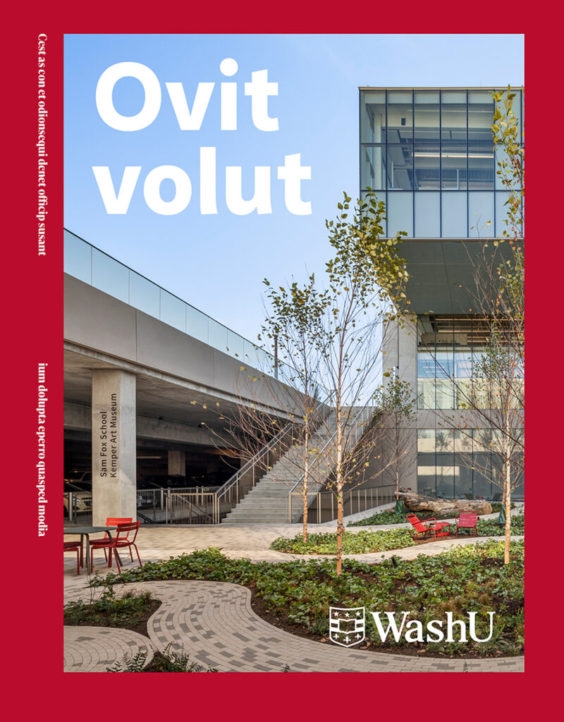
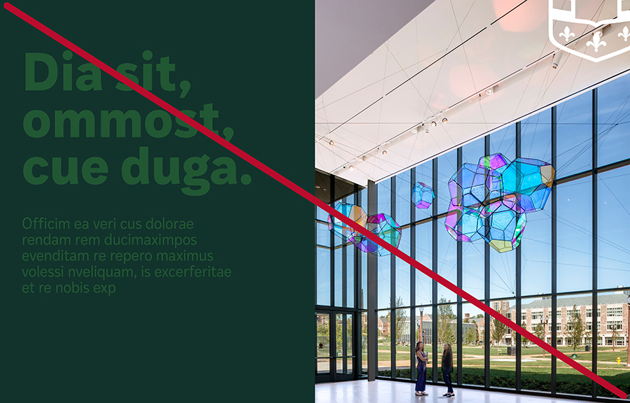
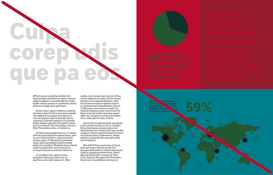
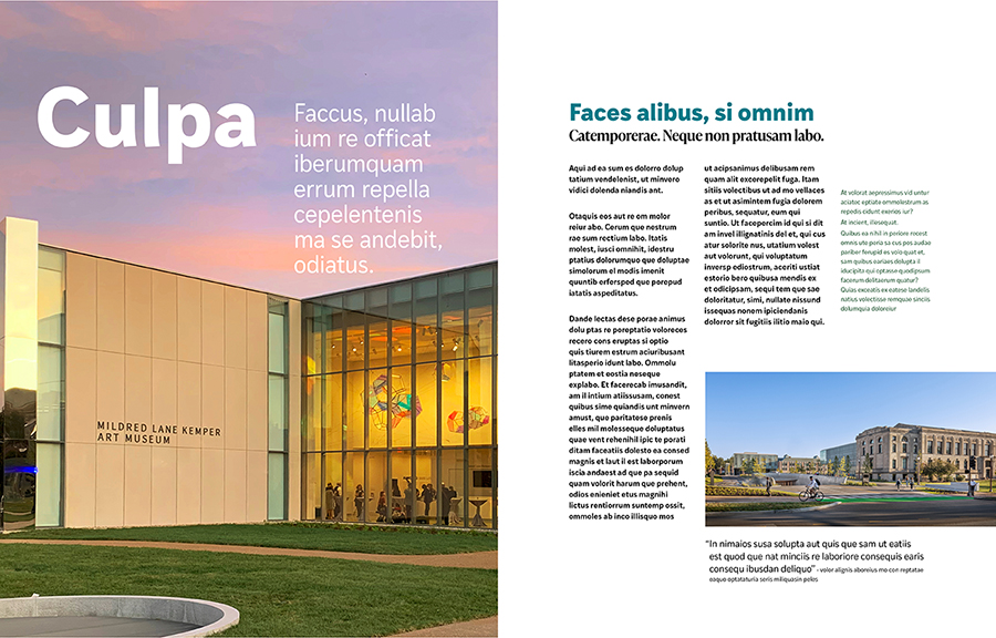
Lead with red. When a color is to be used prominently (such as on the cover of this brochure) the best choice is red, since it has the strongest brand association with WashU.
Limit your layouts to a few colors (with red being the most important) and reserve any secondary or accent colors as ways to create emphasis, rhythm or provide visual hierarchy.
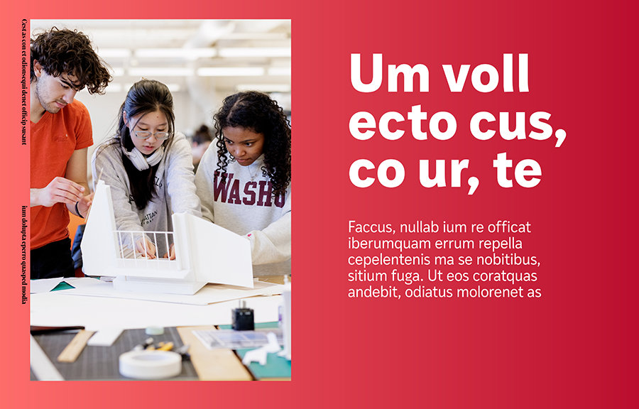
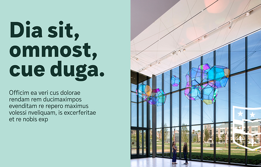
Accent color use
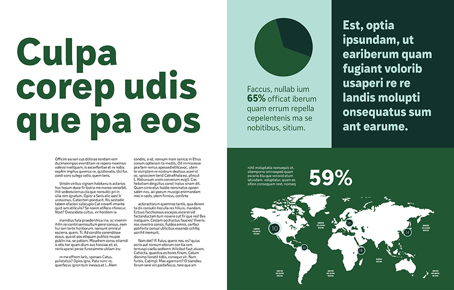
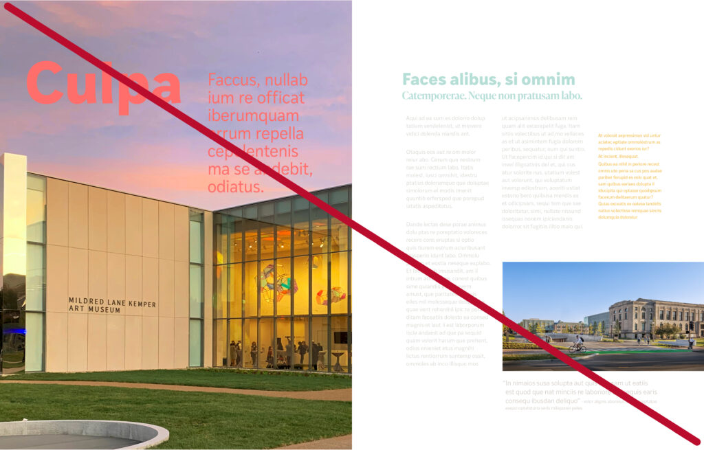
Accent colors can be used in conjunction with the primary and secondary colors. They can serve as backgrounds, to signal a change in subject, or to provide visual relief (such as in the brochure interiors below).
Gradients
Use gradients to provide visual interest while keeping consistent with the hue that is used to create them.

Color contrast
Ensure that you have good contrast between solid backgrounds and text.
Multiple shades
Shades of the same hue offer visual harmony and help to connect related elements on the page.
Shades of red
When using shades of red together in decorative elements, avoid lowering opacity, which can make reds appear dull or muddy. Pair WashU red with dark red at full opacity for the best results.


Reverse text
When reversing text out of photos, ensure there is enough contrast.
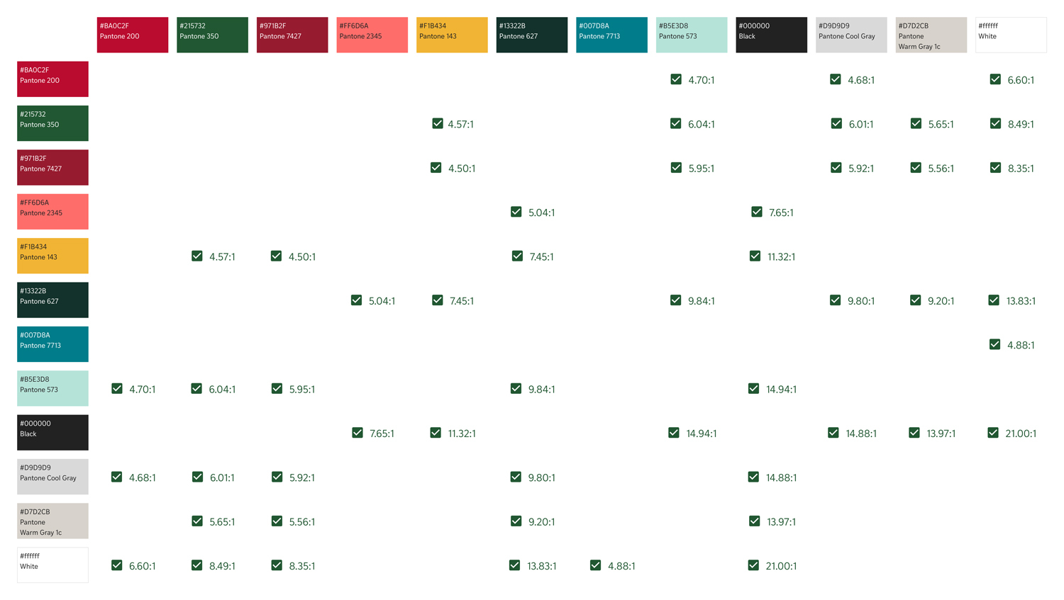
Color and accessibility
The WashU color palette has been selected to maximize our ability to create content that complies with accessibility standards for those with limited vision or reading differences. It is primarily about color combinations with enough contrast between text and background colors.
High Contrast
6.60:1
Text: White #ffffff
Background:
WashU Red, #BA0C2F
Contrast ratio:
6.60 to 1
High Contrast
8.49:1
Text: White #ffffff
Background:
WashU Green, #215732
Contrast ratio:
8.49 to 1
High Contrast
14.88:1
Text: Black #000000
Background:
Cool Gray, #D9D9D9
Contrast ratio:
14.88 to 1
Choose colors carefully to ensure text legibility in all media but especially in digital applications where users may require accessibility accommodations.
This chart shows all the combinations of WashU colors that meet the accessible color-contrast standards for the visual representation of text.